THE NATURAL ENVIRONMENT
Geography 101
ToC
MAPS
Geography
Size
Latitude
Longitude
Time
Maps
New Tools
Maps
Perhaps maps distinguish Geography most. Geographers use maps for just about everything because the field focuses on location. The mapmaking branch of Geography is called cartography and professional mapmakers are cartographers. The art and science of displaying information on maps is evolving rapidly with the advent of digital mapping, but the fundamentals of the field remain essentially the same.
Basic Map Types
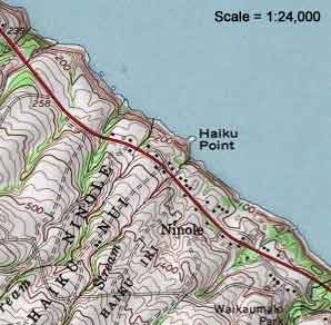
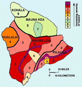
The cartographer must first decide what type of map will best serve the purpose intended. For example, if contours were needed to show the shape of the land, then perhaps a topographic map would be preferred. Topographic maps give 3-dimensional information about the surface and are a standard for hiking, orienteering, research, road construction, and hundreds of other uses. If the cartographer wants to highlight a certain category of information, they would use a thematic map, which shows the distribution of particular features of interest, and usually excluding most other information.
 |
 |
|
|
Topographic Map (Hamakua Coast) |
Thematic Map (Lava Hazard) |
|
|
BOX 1 |
In the topographic map (produced by US Geological Survey), the brown contour lines represent elevation increments of 40 feet (about 12 meters) each. Notice how clearly the stream valleys along the Hamakua coast show up as V-shaped indentations in the contours. Standard topographic maps also include major cultural features, such as houses, schools, roads, boundaries.
The lava flow hazard map on the right (also produced by USGS) shows absolutely no topographic data at all and no cultural features of any kind. Yet, it clearly shows the pattern of its theme, lava hazard zones, without being cluttered by irrelevant information. Consider the powerful meaning of this simple map on risk, development, land values, and insurance rates.
Scale
![]() Next,
the cartographer must decide what scale to
make the map. Scale refers to the ratio between distance on the map
and distance
in the real world. In other words, how much did the cartographer have
to shrink the Earth to fit the map? Scale is usually represented
in
one of two ways. A representative fraction shows the shrinkage
as a ratio. For example, the topographic map above is a standard 1:24,000
USGS topographic map. This means that distances on the Earth are
24,000
times longer than distances on the map itself. Another way to say that
is, one centimeter on the map equals 24,000 centimeters on the real Earth. Or, one
inch on the map equals 24,000 inches on the real Earth. Or, 1 of any
unit
on
the map equals 24,000 of those units on the Earth.
Next,
the cartographer must decide what scale to
make the map. Scale refers to the ratio between distance on the map
and distance
in the real world. In other words, how much did the cartographer have
to shrink the Earth to fit the map? Scale is usually represented
in
one of two ways. A representative fraction shows the shrinkage
as a ratio. For example, the topographic map above is a standard 1:24,000
USGS topographic map. This means that distances on the Earth are
24,000
times longer than distances on the map itself. Another way to say that
is, one centimeter on the map equals 24,000 centimeters on the real Earth. Or, one
inch on the map equals 24,000 inches on the real Earth. Or, 1 of any
unit
on
the map equals 24,000 of those units on the Earth.
![]() A bar
scale also shows distance on the map compared
to distance in the real world. The lava-hazard map shows a bar scale
which indicates what map length is equivalent to 10 kilometers and 10 miles
on the Earth. Bar scales are very popular on maps
because if you change the size of the
map, the bar scale remains accurate. Of course, the bar scale can
be converted
to a representative fraction. If you hold a ruler up to the screen, you
will see that the distance between 0 and 10 kilometers is about 1
centimeter.
So 1 centimeter on the map equals 10 kilometers on the real Earth. If
you do a little math, the representative fraction comes out to be
1:1,000,000.
A bar
scale also shows distance on the map compared
to distance in the real world. The lava-hazard map shows a bar scale
which indicates what map length is equivalent to 10 kilometers and 10 miles
on the Earth. Bar scales are very popular on maps
because if you change the size of the
map, the bar scale remains accurate. Of course, the bar scale can
be converted
to a representative fraction. If you hold a ruler up to the screen, you
will see that the distance between 0 and 10 kilometers is about 1
centimeter.
So 1 centimeter on the map equals 10 kilometers on the real Earth. If
you do a little math, the representative fraction comes out to be
1:1,000,000.
Projection
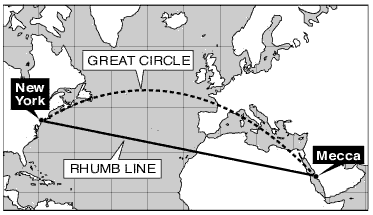
Look at the routes between Mecca and New York on the map. In reality, the Great Circle Route is much shorter even though it appears longer because of map distortion. In fact, all maps are warped in some way. This is necessary because of the inconvenient mathematical fact that you cannot represent a spherical surface on a flat map without distortion.
The particular distortion used is called a map projection and it will vary depending on the purpose of the map. There are hundreds of map projections, but we will consider just two of the most common: Mercator and Gnomonic.
Mercator Projection
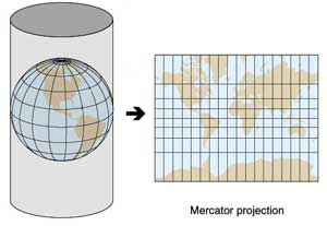 The Mercator map is an example of the cylindrical projection group.
Imagine wrapping a sheet of paper around a globe, impressing the latitude
and
longitude grid, and then unwrapping it. It comes out as a rectangular
map as shown in the figure. These maps are extremely useful in navigation
as they show lines of constant compass direction, called rhumb lines.
To navigate, just draw a line from where to are to where you want to
go
and follow that compass heading. This is especially useful for short trips. Nautical
charts of the Hawaiian Islands, for example, are Mercator maps.
On Mercator maps, latitude and longitude lines form a rectangular grid. While this is wonderful for plotting coordinates (hence their early popularity), they greatly distort areas away from their center (the part of the cylinder touching the globe when wrapped around it). Consider the map shown above. The latitude lines grow farther apart with distance from the equator. This means the higher latitude areas farthest from the Equator are distorted the most. Compare, for example, Greenland and Africa, which look about the same size on the map. In reality, Africa is almost 14 times as large as Greenland.
Gnomonic Projection
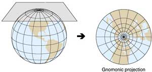 Another
class of projections is planar, in which the geographic grid is
imprinted directly onto a flat plane. One type of planar map is the gnomonic projection,
so called because it can be thought of as a gnome's-eye view of Earth's
surface. (Gnomes are mythic dwellers of Earth's interior.) In the diagram
above,
imagine a light bulb at the center of Earth showing the continents
as shadows
on the flat piece of gray paper. The resulting map is shown on the
far right.
|
|
BOX 2 |
These are also very useful maps in navigation, especially for long distance travel, such as airline routes. All straight lines on gnomonic maps are Great Circle routes, which are the shortest distance between two points on the Earth's surface. To visualize a Great Circle route, imagine stretching a piece of string between points on a globe and pulling the string as tight as you can. By pulling the string to its shortest possible length, it has traced the shortest distance between the two points. When airlines fly long routes, they do not follow rhumb lines, they follow Great Circle routes. Ever hear of a polar route between cities? Fly from Seattle to London for example and you will fly far north over Greenland because that Great Circle route connects the two cities. Note that all longitude lines are Great Circles, as is the Equator.
Like the Mercator, however, Gnomonic projections tend to become wildly distorted as you move farther away from their central point, which is the North Pole in the map shown above.